Web accessibility means that the website can be reasonably used with a keyboard, screen reader, or other assistive technology. Many problems do not arise in the design, but rather in the code — buttons without labels, meaningless icons, poorly marked forms, dropdowns, modals, or navigation.
The contrast ratio is an important foundation and often stems from the graphic design. However, a developer should primarily ensure that the website makes technical sense, has the correct structure, labels, keyboard controls, and a clear relationship between elements.
Labels, states, and relationships for elements that are not clear from the HTML alone or visible text.
Labels, field descriptions, error messages, required states, and a clear relationship between the input and the text.
Dropdowns, mobile menus, modal windows, aria-expanded, aria-controls, and keyboard control.
The website must be usable without a mouse. Focus states must be visible, and the order of elements must make sense.
Important
From June 28, 2025, new accessibility rules under the European Accessibility Act came into effect in the European Union. Web accessibility is no longer just a topic for government websites, but is also required for part of the private sector, especially e-shops, online services, and digital systems for the public.
The technical foundation is mainly a proper website structure, keyboard control, accessible forms, readable labels, ARIA attributes, and usability for assistive technologies. However, this does not mean that every small website automatically falls under the same obligation.
In practice, however, many websites still struggle with basic accessibility. Common issues include unlabeled buttons, forms missing proper labels, modal windows that cannot be controlled via keyboard, or navigation that makes no sense to screen readers. A prime example is actually my own site, where I haven't fully fine-tuned everything everywhere yet :)
ARIA attributes add meaning to elements for assistive technologies. They are mainly used in interactive parts of the website, such as icon buttons, dropdown menus, modal windows, accordions, or forms. They are not a replacement for proper HTML, but they help where an element needs a more precise description, state, or relationship to other content.
Provides a text label for an element when it has no visible text. Typically an icon button for a menu, closing a window, or searching. An alternative is text with the sr-only class.
Indicates that the element's label is taken from another element on the page, most often by its ID.
Adds an additional description. Useful for forms, tooltips, error messages, or field explanations.
Indicates whether the element is expanded or collapsed. Used for menus, dropdowns, accordions, or mobile navigation.
Creates a link between a control element and the content it controls. For example, a menu button and the mobile menu itself.
Informs that the element opens another layer, such as a menu, dialog, or listbox.
Hides decorative or duplicate content from assistive technologies. Mainly used for meaningless icons.
Complements the meaning of an element when standard HTML is not sufficient. It should not be used unnecessarily if a proper HTML element can be used.
Visible highlighting of the active element during keyboard navigation. Without it, the user does not know where they currently are on the page.
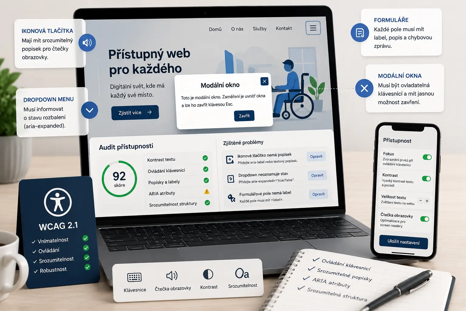
Illustrative image created by AI.
Plain text or images are usually simple. The bigger problems are buttons without text, menus without an expanded state, modal windows without proper relationships, forms without labels, or elements that cannot be controlled via keyboard.
That is why I approach accessibility practically. It is not just about adding a few ARIA attributes, but checking if the element makes sense as a whole — visually, in HTML, during keyboard navigation, and for screen readers.
TIP
Did you know that when an error message appears on a form in real time, a screen reader might not automatically announce it to a blind user? Visually, the error is visible on the page, but if the dynamic message is not in a properly marked live region, for example using role="alert" or aria-live, a user using a screen reader may not learn about it. The field should also be linked to the error message, for example via aria-describedby.
The designer handles the visual appearance, readability, sizes, and contrast. The developer must ensure that the design does not lose its meaning, controllability, and correct structure in the code.
Use the correct elements. A button should be a button, a link should be a link, and headings should have a logical structure.
The website should be navigable via the Tab key, interactive elements must be reachable, and focus must not disappear.
Icons, buttons, inputs, and control elements must have a clear text meaning.
Every field must have a label, a tooltip, any potential error, and a clear connection between the text and the input.
The dialog must have a label, a close option, proper focus, and should not leave the user lost behind the overlay.
Menus, dropdowns, and mobile navigation must clearly state what they open and whether they are currently expanded.
ARIA should not be pasted everywhere. First, there should be proper HTML. Only then is it added where it is necessary to describe a state, a relationship between elements, or a meaning that is not clear from regular markup.
When a button contains only an SVG icon, a screen reader user may not know what it does. An aria-label can provide a description such as “Open menu”, “Close window”, or “Search”.
The button can have aria-expanded depending on whether the menu is open, aria-controls with the ID of the controlled menu, and aria-haspopup if it opens another navigation layer.
The input must have a label. If it also has a tooltip or an error, aria-describedby can be used to make it clear which text complements the field.
A modal must have a clear name, a close option, and proper keyboard control. When a modal window opens, a user using a keyboard or screen reader should only navigate within the open dialog and should not accidentally tab out to the content under the overlay.
It is best to address accessibility right from the start of web development, rather than retroactively after completion.
Forms, menus, modals, focus, buttons, and basic technical accessibility can be audited.
Accessibility can be added even to a finished website, mainly to interactive elements and forms.
Web accessibility means that the website can be reasonably used with a keyboard, screen reader, or other assistive technology. It's not just about contrast, but also about proper labels, structure, forms, navigation, and controls.
ARIA attributes supplement HTML with information for assistive technologies. They are used, for example, for button labels, menu expansion states, the relationship between a button and the controlled content, or an additional description of a form field.
aria-label is used to provide a text label for an element that has no visible text. Typically, it is used for icon buttons, such as a button to open a menu or close a modal window.
aria-controls indicates which element the given button or control element controls. It is used, for example, for a button that opens a menu, dropdown content, or a modal window.
aria-expanded indicates whether the controlled element is currently expanded or collapsed. It is used, for example, for dropdown menus, mobile navigation, or accordion sections.
aria-haspopup informs that the control element opens another layer, such as a menu, dialog, or other dropdown content.
No. The contrast ratio is important, but a large part of accessibility happens in the code. The developer handles semantic HTML, ARIA attributes, keyboard controls, forms, focus states, and proper element labels.
Yes. On a finished website, labels can be added, forms can be fixed, navigation, modal windows, focus states, keyboard controls, and basic HTML semantics can be adjusted.
Write to me about which website you want to check. I will look at forms, buttons, navigation, modal windows, ARIA attributes, focus states, and keyboard control.
Tell me what kind of website or application you need to create.
Submitting any form does not commit you to anything. It is used only for a non-binding inquiry.
Before starting a website project, it is useful to have clarity about materials, WordPress, cookies and tracking.
Examples of real reviews that clients left on my Google profile.
Go to Reviews★ ★ ★ ★ ★„Velká spokojenost. Skvělá komunikace, ochota, rychlost a profesionální přístup. Web i rezervační systém jsou přehledné, moderní a přesně podle mých představ. Oceňuji také trpělivost a pomoc s každým detailem. Určitě doporučuji!“
★ ★ ★ ★ ★„Spolupráce při výrobě webových stránek a údržbě stávajících webovek našich zdravotnických zařízení proběhla a probíhá velmi dobře. Hlavní je proaktivní přístup pana Vančury a rozumná reakční doba v případě požadavků.“
★ ★ ★ ★ ★„Člověk, který své práci a rozumí a ví co dělá. Velmi rychlá komunikace a profesionální přístup. Doporučuji.“
★ ★ ★ ★ ★„Skvělá spolupráce, při dalších projektech určitě nebudu shánět někoho jiného.“
★ ★ ★ ★ ★„S panem Vančurou jsem spolupracovala na tvorbě mých webových stránek a jsem maximálně spokojená. Oceňuji profesionální přístup, rychlou komunikaci a schopnost přesně pochopit moje představy. Web je moderní, přehledný, funkční a skvěle vypadá i na mobilu. Celý proces proběhl hladce, s jasným vysvětlením jednotlivých kroků a výborným výsledkem. Určitě doporučuji každému, kdo hledá spolehlivý a kvalitní přístup.“
★ ★ ★ ★ ★„Spolupráce při tvorbě konfigurátoru proběhla naprosto bez problémů. Oceňuji profesionální přístup, rychlou komunikaci a schopnost pochopit specifický projekt od A do Z. Konfigurátor je přehledný, funkční a přesně odpovídá mým požadavkům. Rozhodně doporučuji.“
★ ★ ★ ★ ★„Velmi dobrá a rychlá spolupráce. Doporučuji!“
★ ★ ★ ★ ★„Přesně takto si představujeme profesionální práci. Dekujeme“
★ ★ ★ ★ ★„Ať už se jedná o optimalizaci webu, nebo tvorbu na míru oceňuji kromě profesionální práce a znalostí problematiky také férový přístup a komunikaci.“
★ ★ ★ ★ ★„Děkuji za profesionální spolupráci, vše dle domluvy, naprostá spokojenost a mohu jen vřele doporučit.... Při dalších projektech určitě opět využiji Vašich služeb“
★ ★ ★ ★ ★„Profesionalita a velká ochota, nemohu jinak než doporučit“
★ ★ ★ ★ ★„Skvělá zkušenost při tvorbě webu, profesionální přístup, rychlost, ochota pomoci“
★ ★ ★ ★ ★„Rychlá spolupráce a komunikace – mohu jen doporučit.“
★ ★ ★ ★ ★„Moc mi pomohl, když jsem potřebovala pomoc s webem. A bylo to gratis :)). Jsem mu neskonale vděčná.“
★ ★ ★ ★ ★„Děkuji Jiřímu za rychlou a kvalitní spolupráci na tvorbě webu. Srozumitelná a ochotná komunikace mě vždycky potěší a přináší důvěru.“
★ ★ ★ ★ ★„Jsem maximálně spokojená. Rychlost, ochota a cenově dostupné. Děkuji“
★ ★ ★ ★ ★„Naprostá spokojenost. Rychlá komunikace, skvělá cena a odborná pomoc. Moc děkuji :)“
★ ★ ★ ★ ★„Velká spokojenost, rychlost a p. Vančura moc dobře ví co dělá. :)“
★ ★ ★ ★ ★„dobrá práce, rychlá odezva“
★ ★ ★ ★ ★„S programátory mám zkušeností hodně, ale tady musím opravdu pochválit. Pro mě a mé přátele vytvořil skvělý nástroj na evidenci sbírek a opravdu se to povedlo. Bylo to hotové rychle, kvalitně a za skvělou cenu. Komunikace funguje velmi rychle, což je super a ne úplně standard. Díky za super práci, za mě 100% spokojenost!“
★ ★ ★ ★ ★„Vše bylo rychlé a hlavně to funguje. Dobrá práce.“
★ ★ ★ ★ ★„Normálně recenze nepíši, ale zde rád doporučím kvalitní práci. Jiří pro mě vytvořil web pro dětské tábory. Kvalitní práce, rychlá komunikace a vlastní nápady, které Jiří sám přidá, jsou na velice vysoké úrovni. Nemohu hodnotit jinak než 5/5.“
★ ★ ★ ★ ★„Pan Jiri nam delal jiz 3 webove stranky a vzdy velka spokojenost, je mega rychly a vse hned kladne vyridi, mohu pouze doporucit. Poradi si bez problemu i s rezervacnimi kalendaremi, udrzbou socialnich siti, atd.“